Not Sure What Color? Let's Figure It Out Together.
A free color consultation is included with every estimate. Bring your inspiration, your worries, your Pinterest board — we'll help you land on a palette you'll love.
Free
With Every Estimate
Expert
Color Eye
Palette
Development
On-Site
Sampling
What We Actually Do in a Consultation
Lighting Assessment
We look at how natural light hits each room throughout the day, what kind of bulbs you use, and how that changes color appearance.
Architectural Review
Trim style, ceiling height, flooring color, fixed elements like fireplaces — these all narrow down what palettes will work.
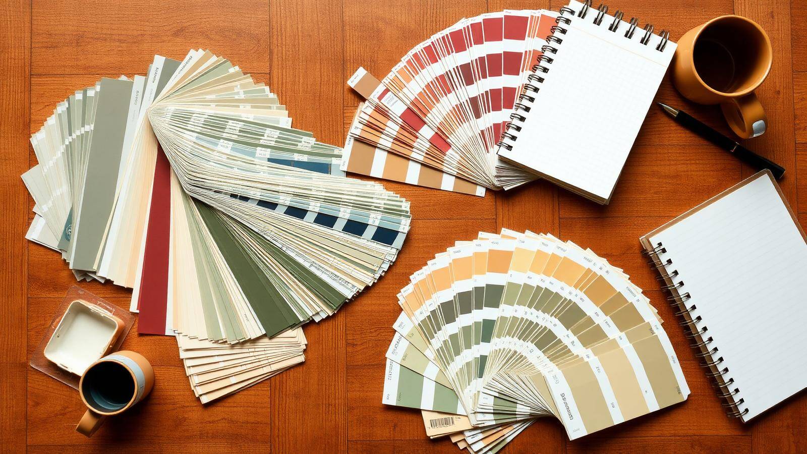
Fan Deck Sampling
Real Sherwin-Williams and Benjamin Moore fan decks held up against your walls, in your light, with your furniture.
Test Patches
For colors you're seriously considering, we recommend small test patches before committing — light changes everything.
Whole-Home Coordination
If you're painting multiple rooms, we make sure colors flow naturally from space to space without clashing.
The Three Things That Trip People Up
Warm vs. Cool
Every color leans warm (yellow/red base) or cool (blue/green base). North-facing rooms with cool natural light usually need warm paint to feel inviting; south-facing rooms can handle cooler colors.
Undertones
"White" is rarely just white. It might lean pink, yellow, green, or blue. The undertone has to coordinate with your flooring, countertops, and fixed elements — that's where most DIY color choices go wrong.
LRV (Light Reflectance Value)
Every paint color has an LRV from 0 (black) to 100 (white). Knowing the LRV tells you how a color will read in your specific light. A low-LRV color can feel completely different in a bright room vs. a dim one.
Six Palettes That Work in Western PA Homes
These are starting points we frequently come back to. Each one can be tuned warmer, cooler, lighter, or darker for your specific home.
Modern Farmhouse
Warm whites, soft blacks, sage accents — the western PA classic.
#F4EFE6#D4CCBE#7A8471#2C2C2CCoastal Calm
Cool whites with deep navy and weathered teal — fresh and timeless.
#F2F4F3#A6BFC9#506C7E#1B2B3AWarm Neutrals
Greige, taupe, soft cream — quiet sophistication for any architecture.
#EAE3D6#C9BFAA#8C7E68#4A4032Classic Heritage
Deep colonial reds, hunter greens, ivory trim — perfect for older homes.
#F1ECE0#7C2A1B#33503D#1F1A14Quiet Contemporary
Soft warm whites, cool charcoal, muted clay — for modern interiors.
#F8F5EF#C5BFB5#3F3F3F#B07A5CGarden Inspired
Cream, sage, dusty rose, and soft blue — feels like a botanical print.
#F6F2E8#B6C7A6#D7B0A7#9DB5C5Let's Find Your Colors
Color consultation is included free with every estimate. Tell us about your project and we'll set up a visit at a time that works for you.
Stop second-guessing your color choices.
A trained eye, real fan decks, and your specific light — together for free.